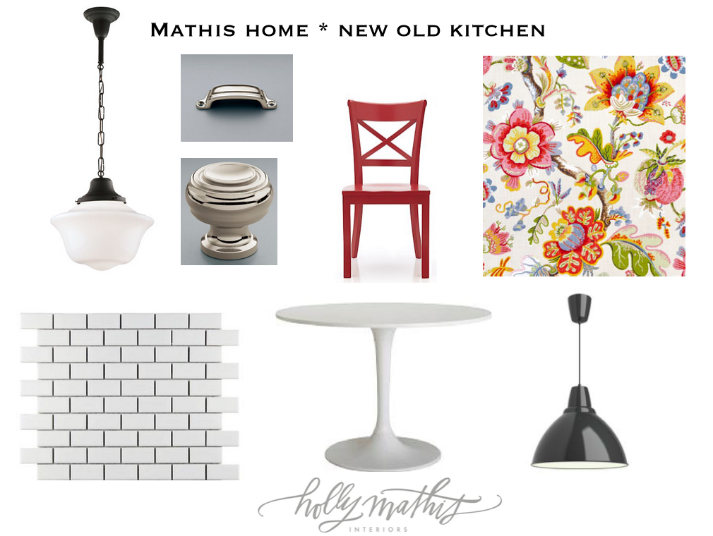
I am going to show you some updates/peeks of the new old kitchen… Started months ago when we first put the house under contact with this idea board. From the beginning I knew this needed to be operation “lipstick on a pig”…in other words cute but on a budget using fabrics and elements I already had, no gut job, nothing major…so here we go!
I am thinking there will be a more in-depth kitchen post later with sources and before and afters. It’s not totally complete, nothing hung on walls and no drapes and shelves still not totally styled…but for now here it is! What did we mainly do…lots and lots of white paint….SW Pure White to be exact. I know its cliche but it really is amazing what a coat of paint can do to a space! I honestly didn’t intend to take uppers on sink side down but it just happened. I DID want to do new shaker doors on cabinets but ended up NOT doing that…funny how projects evolve!
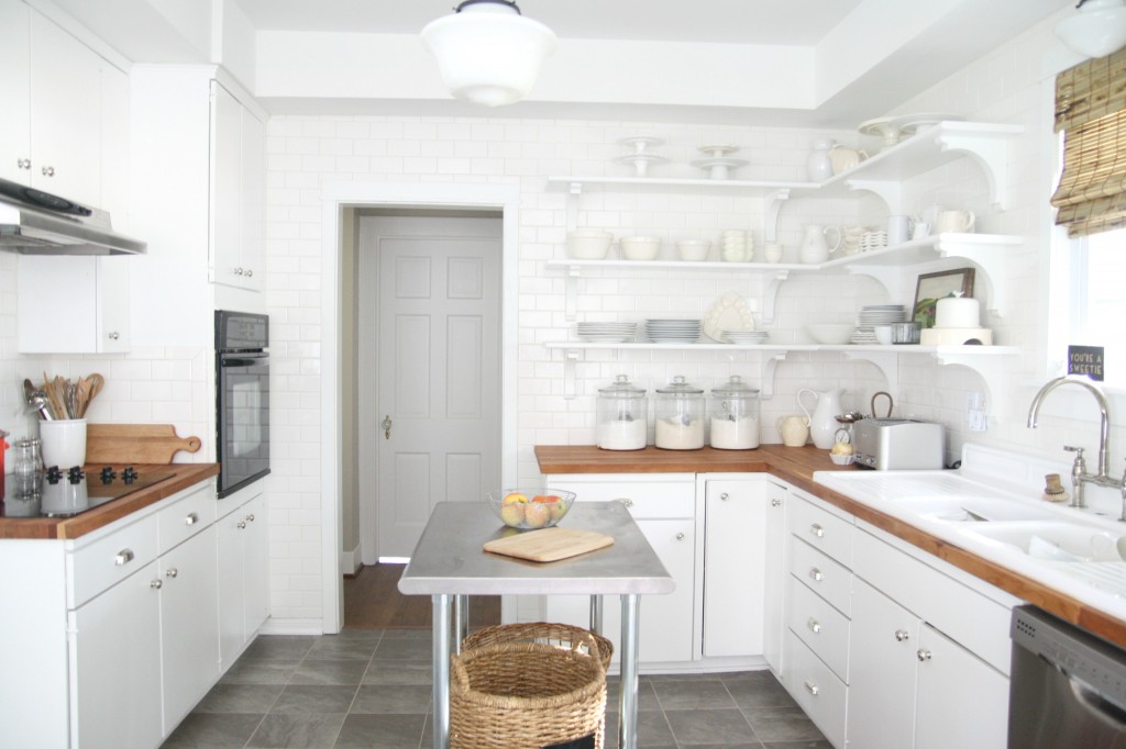
Yep see what I mean the toaster and coffeemaker are out so this not STYLED (we decorators have to make those disclaimers;;) and I need to scrub paint off of the stool but Daddy got the blind up and the light over sink finally works!
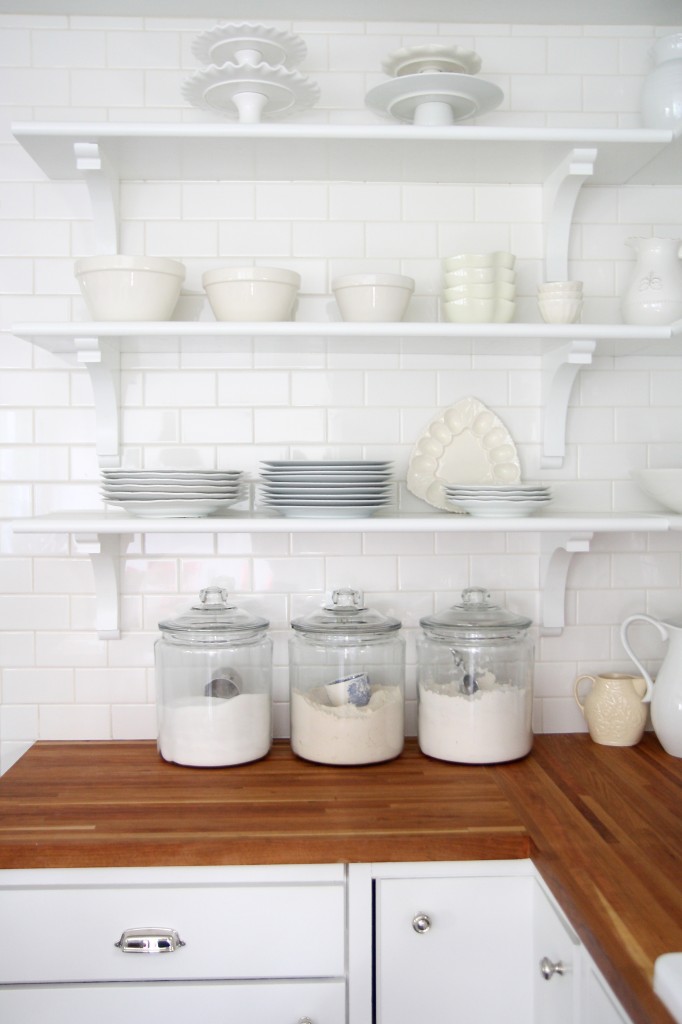
I will be doing another post about the counters, they are Old Williamsburg butcher block from Lumbar Liq..I am not a huge fan I think because I am coming off of marble. Honestly I hate to whine about the counters with all that is going on in the world and I want to loveeee them but I miss the marble. The waterlox made them orange I think. I don’t love the waterlox. I have sanded and sanded and I think sanding with steal wool and mineral oil is the best bet with wood counters
I DO love the subway and shelves..I wish I had gone darker with grout but it’s still all good.
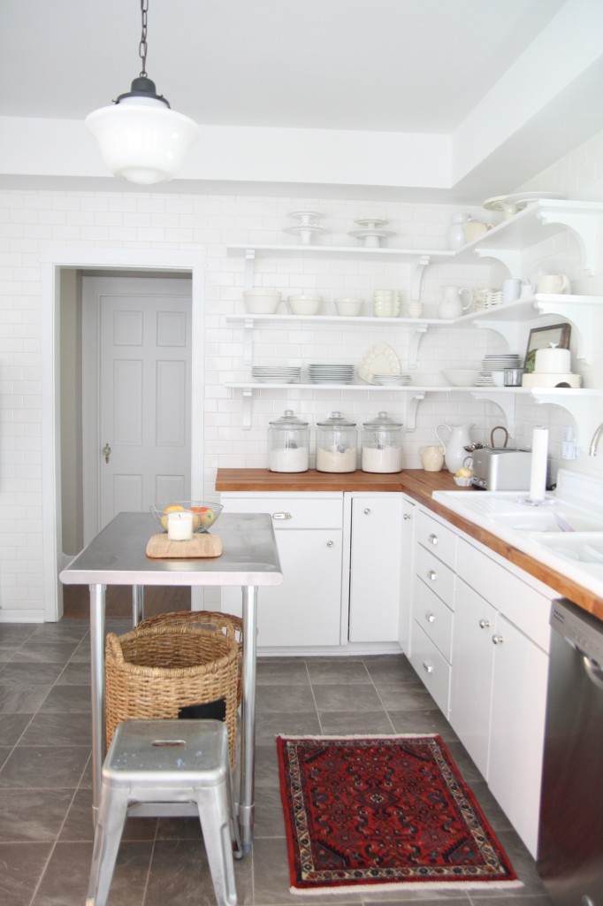
Love that we did tile over the door…need a longer runner. Floor was this gray vinyl when we moved as are cabinets we just painted them…. or I should say the world’s most patient and talented carpenter did it all…Kevin Gilmore of Oaks Construction…he pulled out old uppers and did tile and shelves! I knew I could live with the floors and that saved a bundle.
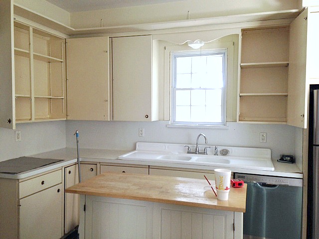
BEFORE with the upper cabinets! Of course the sink came back in…so thankful to the previous owners for refurbishing it (new enamel)..the sink is original to the home as far as I know. It is shallow but the extra sides make it nice with wood counters.
BEFORE
and AFTER with subway and shelving and stainless table from Amazon.
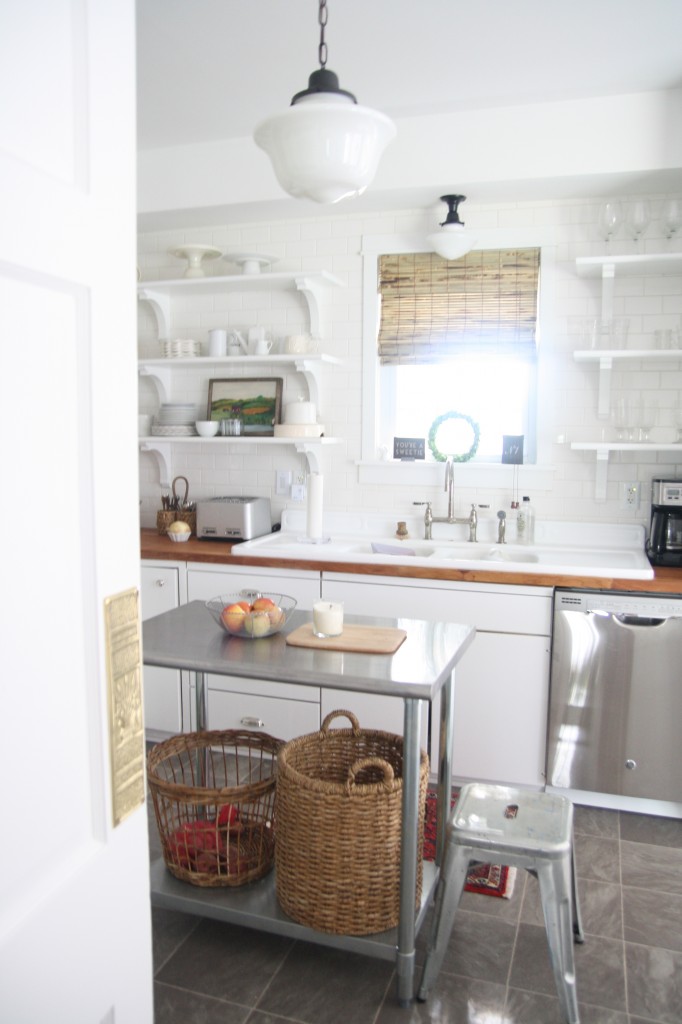
Yes I know it looks like my old kitchen and others I have done . . . it’s because I like white and red and subway tile and schoolhouse lights and bamboo blinds. I won’t apologize for that…I do what I love and I am grateful I was able to translate that look here without having to change too much! I just like what I like!
Okay so old houses are quirky and this kitchen’s quirk is that it was originally half the size and then later I think the breakfast eating area and laundry room were added on probably from an old porch….well the floor SLOPES ever so gradually as you walk to that side of the room. Yep you don’t want to drink a glass of wine while touring my kitchen. We left the slope thinking we will tear this all out in a few years and level it out and do new cabinets and wood floors then. It doesn’t bother me but I think it makes the hubs a bit vertigo-ish. So less you think things around here are too perfect,..they aren’t even level! ha ha. But hey we’ve got a cool faucet and subway tile! lol..LAUGH WITH ME PLEASE. I think in old houses you have to just prioritize, what is feasible to do asap before you need to move in, what you can spend on NOW and what has to wait. That is what we tried to do . . .wise choices and some lipstick/paint where needed.
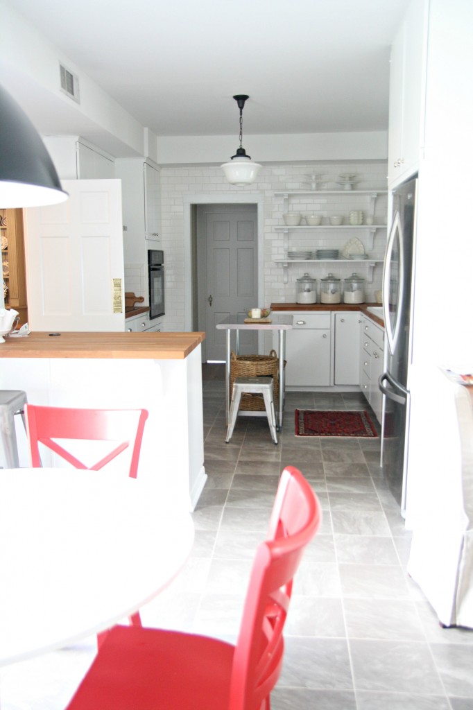
SO as we roll our marbles toward the laundry room you see our breakfast area. Complete with IKEA dockets table and red Crate and Barrel chairs. I love me some red oh yes I do. My colorful dining drapes are going to go over the sliding glass door next to this area! The gray $29 foto pendant from IKEA got a coat of black spray paint because it was the same color as the floor. The barn door and track are from good ol Home Depot. Kevin had to retrofit it all.
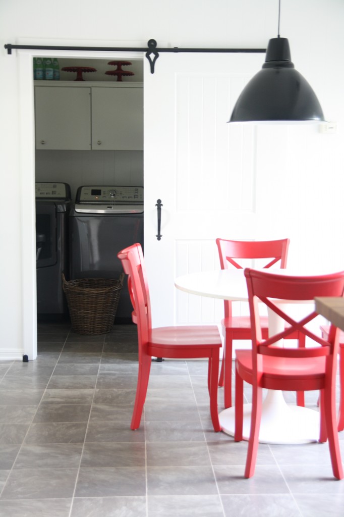
I am so thankful I now have a washer and dryer INDOORS. Y’all that cute charming screened porch I used to have. I may miss it but won’t miss the laundry room at the end of it! This is so much better! That and large capacity have changed me!
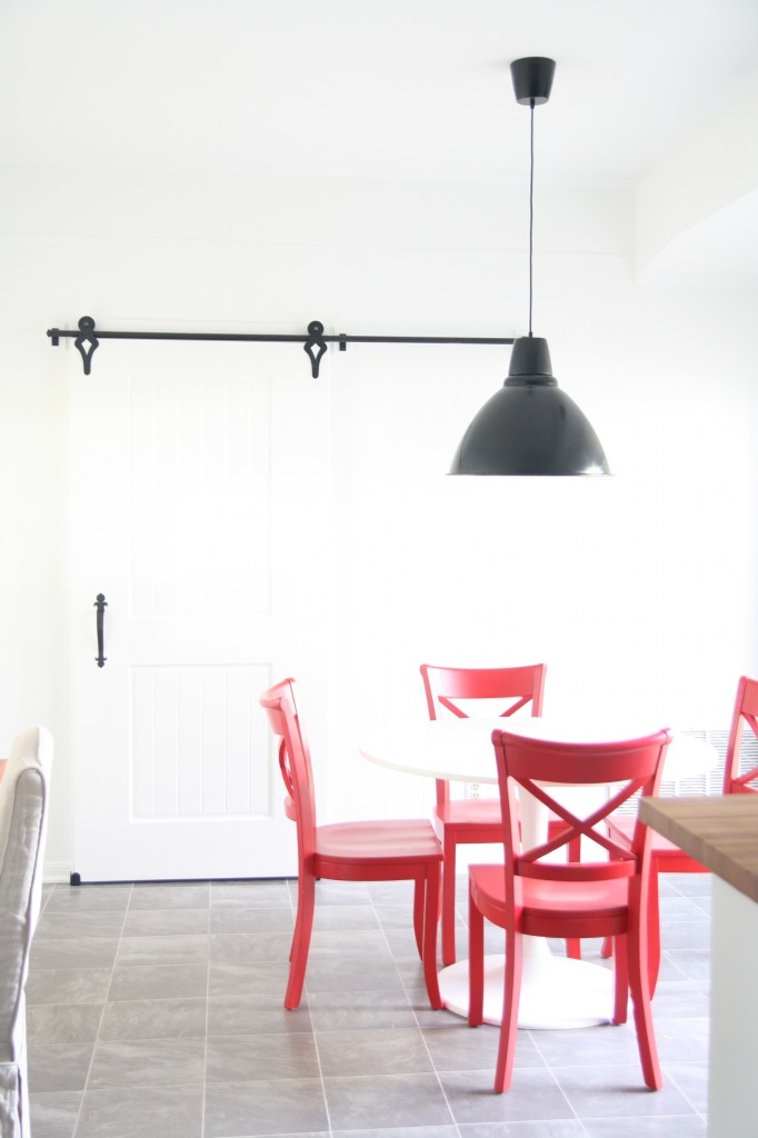
Open and close…so smooth and easy and takes no space. I thought Henry would be obsessed with sliding it back and forth but so far he hasn’t been too intrigued (knock on wood) . . .Oh and can you tell I found my good camera and I am relearning the settings….I might start posting more than iPhone pics again;
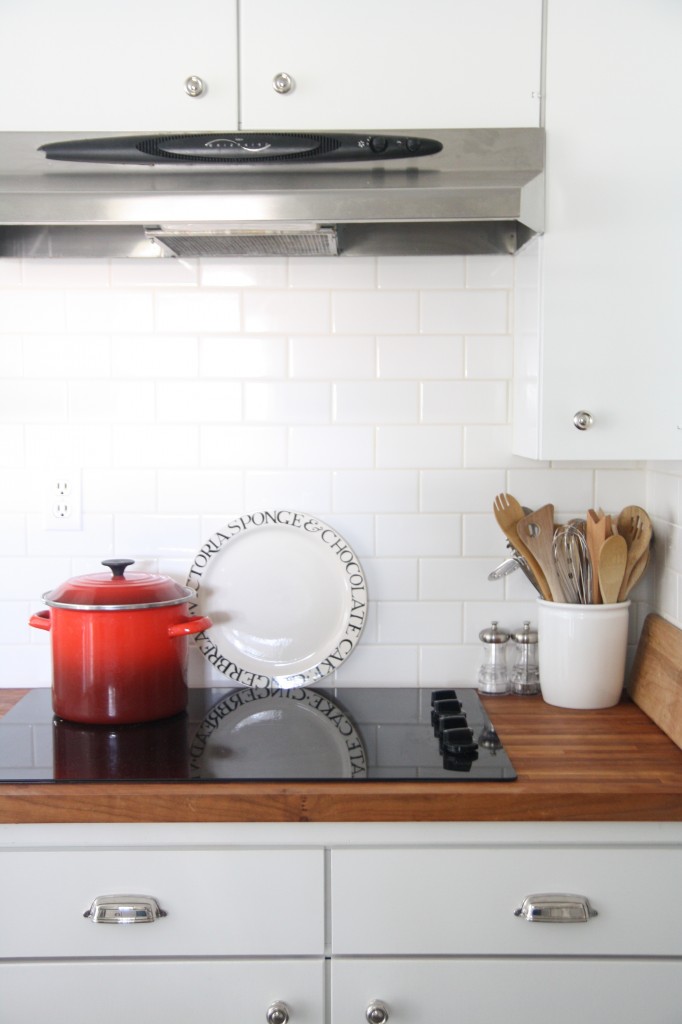
And this is where the magic happens (not!) Seriously I do miss our stove from other house but this is fine; And who are we kidding I am not a fancy cook. The fresh paint and subway makes it all so nice. So grateful. Hardware is from polished nickel Gilmore from RH.
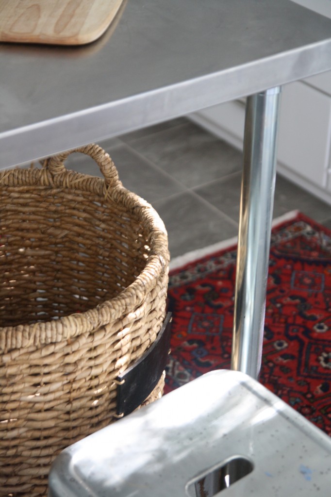
Amazing how a simlpe basket and Amazon work table can make it feel more like home. I love all of the white but the little painting from Etsy and chair and rugs give the color I crave..I tell you I can’t wait to get those drapes up!
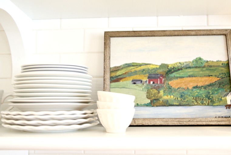
Brackets from Home depot…the shelves are stair treads.

So there ya go..thanks for looking at our new old home..back to packing/unpacking/organizing/purging!
Original article and pictures take www.hollymathisinteriors.com site
Комментариев нет:
Отправить комментарий